From Ziploc to Display Box: How Weed Packaging Changed


Bag Culture · Episode 1 of 7
A clear bag with a name scribbled on it tells one kind of story. A white box that opens into a coordinated world of colors, patterns and photographs tells another. Neither needs a long introduction. You can see the difference before you read a word.
Cannabis packaging history is interesting because the container records more than a design trend. It can show how people identified things, how public-facing businesses presented themselves, and which details someone thought were worth printing. The bag did not suddenly become a box everywhere on the same day. Different places had different timelines.
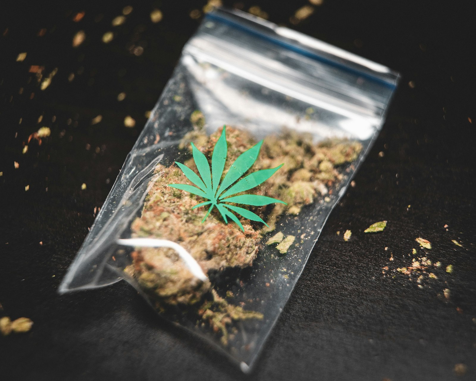
The simple bag survives in people’s memories
In a January 2022 r/trees discussion, the person starting the thread contrasted the professionally labeled packages they were seeing with the bags they remembered from the 1990s. Other commenters brought their own examples and disagreements. Read those as memories from particular people, rather than a complete history of every neighborhood.
The appeal of that old image is obvious: one container, one handwritten name, very little visual drama. A marker gives the label a human touch because someone literally wrote it. It also leaves huge gaps. A nickname on a bag is a different information system from a printed label that has separate fields for identity and batch details.
This is where nostalgia becomes more interesting than just saying the old days were better. What does someone actually miss? The familiar handwriting? The lack of marketing? The people attached to the memory? Those are different answers, and all tell you more than declaring every plain bag authentic.
Scroll the packaging glow-up
Leafs by Snoop: the full design gallery — Flat artwork, finished boxes and little design details all show up together. The packaging has a whole visual personality.
The record is bigger than the bag
The Smithsonian’s collection includes an EZ Wider rolling-paper case. It is an example of an everyday cannabis-adjacent object being preserved as material culture. The useful lesson is that ordinary things can become historical evidence: lettering, wear, color and the way an object was put together all survive after the original moment has passed.
A collection object also slows the conversation down. You have a specific item to examine instead of a vague picture of an entire decade. A printed brand name, a physical format and a dated museum record make a much better starting point than somebody’s claim that everyone used exactly the same thing.
There is room for both forms of evidence. A person’s memory tells you what they remember experiencing. An artifact shows you an object that actually survives. Put them beside each other and the history starts feeling less like a slogan.
When the package becomes a whole visual world
Pentagram’s documented Leafs by Snoop project gives a concrete example of the design shift. Its identity uses a faceted leaf, while the packaging combines a restrained exterior with colorful California imagery inside. The case study describes details such as a tactile paisley varnish and coordinated stickers. Those are specific design choices, not a general claim about every cannabis brand.
Our read: the box asks to be looked at from more than one angle. The front establishes recognition. The inside supplies another part of the mood. Repeated shapes make the two feel related. That is different from putting a loud picture on an otherwise anonymous container.
Think of the difference between a handwritten CD and a complete record sleeve. Both can identify music. One also has room for typography, artwork, credits and a visual identity that follows the release around. The comparison explains the packaging, without asking the artwork to prove anything about the contents.
The printed information changes the layout
California’s current manufactured-product checklist separates required information between label panels and says certain supplemental labeling must remain attached. A QR code cannot simply replace it. This is one state’s example, but it shows why the modern package has to organize information as well as attract attention.
That creates a real graphic-design problem. A brand title may need to read quickly while other details remain findable. A colorful background needs a quiet place for smaller type. A small container limits the space available. The result can be clean and understandable, or a crowded argument between several things trying to be the headline.
Look at the progression through those jobs: a handwritten nickname, a recognizable brand mark, a coordinated series, and an information layout. Each adds a different kind of detail. The most interesting package is often the one where you can still tell what every detail is doing.
The box can be worth keeping. The plain bag can carry a real memory. Cannabis packaging history has room for both, as long as the object and the story stay connected. A weed packaging history comparison works better when it separates a remembered plain bag from the dated design and labeling record of a specific box.
Sources and further reading
- Reddit discussion: packaging nostalgia, January 2022
- Smithsonian: EZ Wider rolling-paper case collection record
- Pentagram: Leafs by Snoop design case study
- California DCC: manufactured-product labeling requirements
Series cover: original AI-assisted editorial illustration for Trap Snap LA. Photographs carry their own credits.
Questions about weed packaging history
Why can a modern weed box have two label panels?
California’s manufactured-product checklist distinguishes a primary panel from an informational panel. The front-facing identity and the supporting information have different layout jobs.
Does a jar inside a cannabis box need its own symbol?
In California’s manufactured-product guidance, the immediate container must carry the universal symbol when it can be separated from outer packaging. This is one reason the inner jar and outer box are different design surfaces.
Is spot varnish the same thing as a different printed color?
The distinction in this example is a surface finish: Pentagram describes clear, tactile paisley spot varnish on the Leafs by Snoop outer box. The selected finish adds texture/appearance without simply being another color patch.
Do weed packaging memories prove what everyone used in the 1990s?
No individual memory can establish a nationwide pattern. For a narrower documented comparison, the designer’s case study can show one specific packaging project and its design decisions. That is a different kind of evidence from a recollection.
Tags: weed packaging history from bags to boxes; cannabis packaging labels and design changes