Why Some Weed Bags Look Like Album Covers

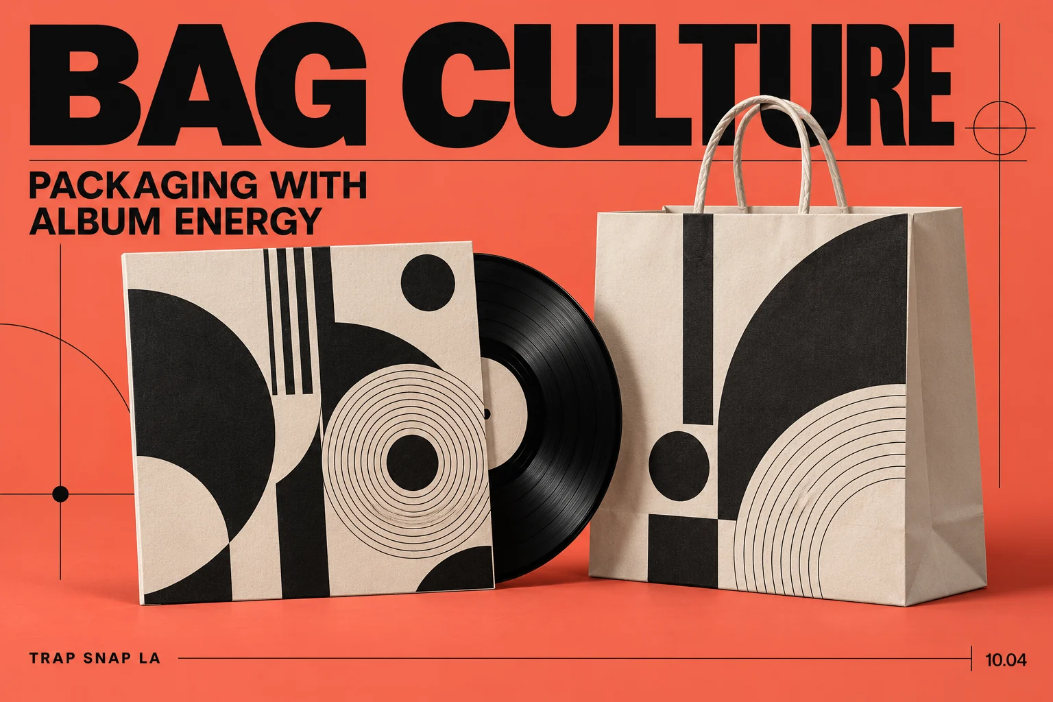
Bag Culture · Episode 4 of 7
Album-style weed packaging can look like it should have a track list on the back. A big title, a deliberate color palette, an illustration with a whole mood, and a small set of repeated details can make a package feel closer to a record sleeve than an anonymous container.
That comparison is an interpretation of the design, rather than a claim that every illustrator copied an album. Cannabis packaging design and music artwork share an obvious challenge: give people something recognizable that still holds together when it gets shrunk into a tiny image.

A title can do more than identify a name
The shape of lettering changes the mood before the words have been read. A condensed block title feels different from a loose handwritten one. Large lettering can make a composition feel direct. A small title surrounded by space can make the image feel more important.
These are visual judgments, so they are not universal personality tests for fonts. The useful point is that the letterforms are doing work alongside the words. Replace one type style with another and you can change how the same title lands.
On a record sleeve, the artist and release title need a relationship. On a package, the identity and the smaller information need one too. When every line is set as if it deserves headline status, the design becomes a fight. When the sizes have an order, your eye has a route through it.
A bag that thinks it is a poster
Ben’s Best Blnz: type, art and packaging — The bold lettering and artwork make this a good visual detour after talking about album-cover energy.
The repeated detail makes a series feel related
A consistent border, a recurring symbol or a particular approach to illustration can connect several designs without making them identical. You see the difference in each release while still recognizing a common visual world.
That is one reason the album-cover comparison is useful. A body of work can share a theme through color, typography or composition. It does not need the exact same picture on everything. The interesting question is which detail survives when the main image changes.
The same question can be asked of a packaging series. Strip away the name and there may still be a recognizable shape, rhythm or arrangement. If the only connection is a giant logo, the visual family has less to explain.
A documented Snoop example gives the comparison substance
Pentagram’s Leafs by Snoop case study connects its design choices with Snoop’s own visual references. The project describes a faceted leaf, angles in the imagery, and a paisley detail linked to bandannas. This gives us a specific account of how music identity and packaging identity were brought together.
The useful part is the relationship between the choices. An angle can connect a logo with an image treatment. A repeated pattern can carry a recognizable reference across different formats. A restrained exterior can make a colorful interior feel more noticeable.
You do not need to borrow Snoop’s exact pattern or leaf to understand the idea. The lesson is to find a coherent relationship between references, rather than pile every recognizable symbol onto one surface.
Familiar culture and copied artwork are different things
A design can refer to a visual era through its own original colors, lettering and arrangement. Reproducing a famous album image is another matter. Familiarity alone does not establish permission, and a convincing imitation should not be presented as an actual collaboration.
This is why a proper credit can improve a design story. It tells you whose illustration you are seeing and which project it belongs to. An attributed designer statement can explain the intended reference. Without that source, a viewer can still describe a resemblance, but should keep the resemblance separate from an origin claim.
The same goes for a musician’s face. A portrait is a visual feature. Evidence of a licensed brand relationship needs something more concrete than recognizing the person. Our celebrity-brand article follows those distinctions in more detail.
The thumbnail is where the composition gets tested
A package may look impressive in a close-up while becoming a blur at a smaller size. Large shapes survive reduction better than a dense collection of tiny details. Fine texture may reward the close look, but it cannot do every job from a distance.
This is part of what makes a good cover-like composition interesting. There is an immediate idea and then something else to notice afterward. The front gets your attention; the lettering, illustration and small choices hold it.
The most useful way to talk about the album-cover look is to describe those choices. Which element leads? What repeats? Which detail connects with the wider identity? A package can have an entire visual mood without pretending it is a record sleeve, and the comparison becomes more interesting when the design has its own idea.
Sources and further reading
Series cover: original AI-assisted editorial illustration for Trap Snap LA. Photographs carry their own credits.
More questions about album-style cannabis packaging
What is spot varnish on cannabis packaging?
It is a selectively applied finish rather than a whole new printed picture. Pentagram’s Leafs by Snoop case describes clear, tactile spot varnish used for the outer box’s cannabis paisley pattern. The design project’s finish description.
Did Snoop write the phrases on the Leafs by Snoop stickers?
Pentagram says the collectible stickers featured phrases handwritten by Snoop. That is a specific documented contribution, distinct from assuming he personally designed every part of the packaging. Pentagram’s project account.
Why do the Leafs by Snoop pictures have angled slices?
The designers say the sliced California images echo the angles in the logo. That first-party explanation supports a visual relationship instead of guessing that the treatment copied a particular album cover. The designers’ image-treatment explanation.
Did the Leafs by Snoop packaging style also appear on its website?
Pentagram says the project’s website continued the paisley pattern, bright colors and faceted California imagery. This is a documented project example of one visual system spanning packaging and screens. The website design description.
Tags: Leafs by Snoop packaging design details, cannabis packaging typography and music references