Why Some Cannabis Labels Are Impossible to Read

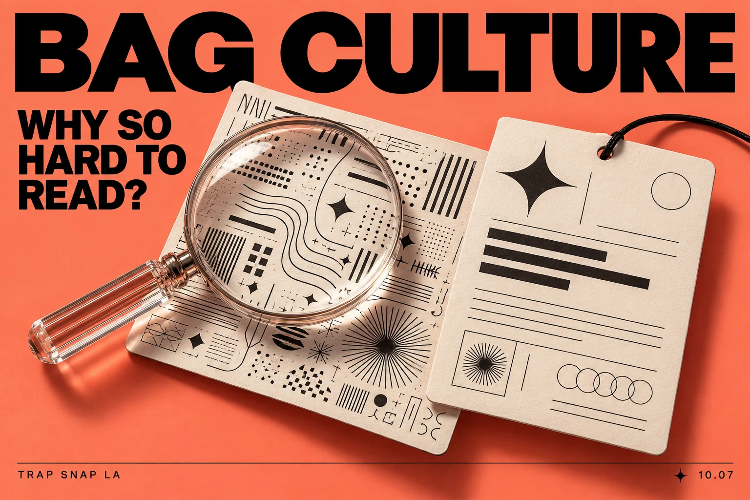
Bag Culture · Episode 7 of 7
The front looks clean. The logo is sharp. Then you try to read the small line and suddenly you are tilting the container like there is a secret message hidden in the reflection. A label can be visually impressive and still make the simplest information annoying to find. Cannabis label font size, contrast and placement all affect whether the required information can actually be read.
Cannabis label readability is about that gap. The important detail may be present, but the combination of small type, low contrast, glare and crowded layout makes it difficult to use. Good-looking and easy to read are related goals, not interchangeable descriptions.
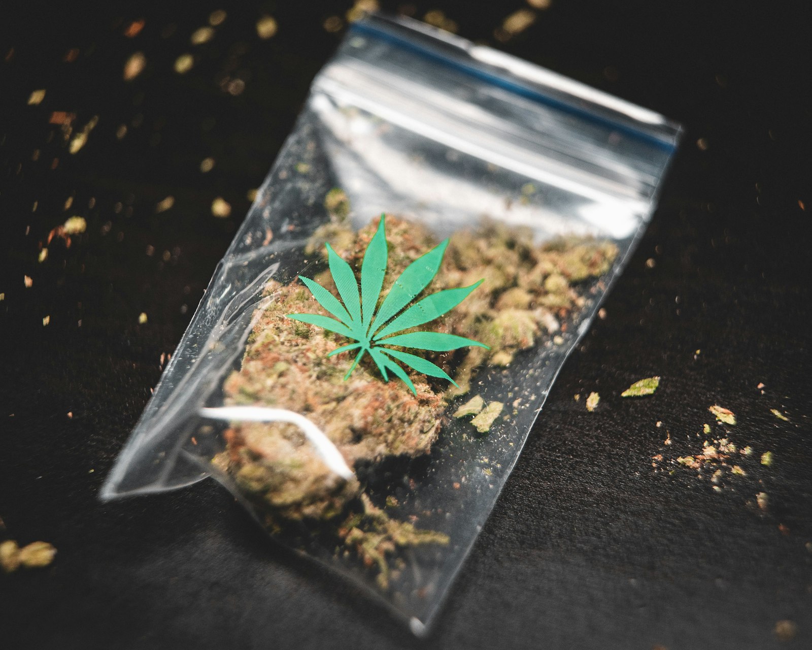
Cannabis label font size and information hierarchy
The big identity is meant to be recognized quickly. The supporting information is meant to be read more closely. Those are different jobs, and the type should help you tell which line is doing which one.
Imagine a fictional label where the title is enormous, the product description is tiny, and the batch field is squeezed onto a patterned corner. Nothing is technically missing from that invented example. The problem is that the visual order sends the reader toward the least specific word and makes the practical lines hard to locate.
A cleaner version would give the description a clear place, group the related fields and reserve a quiet background for the smallest text. That is a concrete change in hierarchy rather than a new decorative effect.
A typography palate cleanser
Big type on cannabis packaging — Scroll through the lettering and compare the pieces you can read immediately with the ones that need a closer look.
Contrast is more than choosing two different colors
Two colors can look distinct and still make a difficult text-and-background pair. Fine lettering over a busy image has to compete with every edge behind it. A pale line on a similarly light background may practically disappear, even if the palette looks coordinated.
RNIB’s accessible product-design guidance emphasizes clear, readable visual information. For a label discussion, the useful takeaway is to give practical text a strong, comfortable contrast and a clear shape. This is accessibility guidance, not a cannabis-label legal minimum being asserted here.
You can see the issue in ordinary objects too. A pale menu printed on cream paper, a shiny ticket with a tiny seat number, or a complicated poster with an almost invisible date can all make the reader work harder than necessary.
The physical surface gets a vote
A glossy finish can produce glare. A curved container can make a line harder to view all at once. A flexible surface can crease through the small print. Those conditions affect the reading experience even when the flat design file looks tidy.
That is why a realistic mockup and an actual photograph answer different questions. The mockup shows a proposed arrangement. The photograph can show how the arrangement behaves on a physical object under the pictured light. Neither should be mislabeled as the other.
Our design judgment is that the quietest surface should often support the most practical information. The decorative area can have more room to play. Mixing the two without a clear plan is how a beautiful pattern ends up fighting with the words people actually need.
Spacing can solve more than another font
Related information benefits from being grouped. Unrelated items need enough separation that their relationship does not become ambiguous. A title, a short description and a batch field should not look like one long sentence accidentally broken across a container.
The small changes are sometimes the most useful: more space around a field, a consistent alignment, or one plain type style for the supporting lines. A font change alone cannot fix a layout where nothing has an obvious place.
For a fictional before-and-after comparison, keep the words identical. In the first version, imagine the batch field buried beside an ornament. In the second, give it a labeled area on a plain background. The improvement comes from organization, so there is no need to invent a new seal or claim.
Required information still needs to be usable information
California’s manufactured-product checklist says required labeling must be clear and legible. Its panel requirements also show that different pieces of information have different places to occupy. That is a specific regulatory example, rather than one universal layout for every jurisdiction.
Presence and readability are therefore separate questions worth asking. Is the information there? Can someone find it? Can someone read it without fighting the surface? A scannable code may lead to extra context, but it should not distract from the attached information that must remain readable.
The best small-print design feels almost uneventful. You find the detail, read it and move on. No dramatic reveal, no reflection puzzle, no guessing which number belongs to which line. That is a useful kind of quiet, and it leaves the artwork free to be interesting somewhere else.
Sources and further reading
Series cover: original AI-assisted editorial illustration for Trap Snap LA. Photographs carry their own credits.
Frequently asked questions about cannabis label readability
What is the minimum font size for California manufactured cannabis labels?
California’s checklist sets a minimum of 6-point type for required labeling, which must also be clear, legible and in English. Meeting the size minimum does not remove the legibility requirement. California manufactured-product label checklist.
Can a QR code replace required cannabis label information in California?
No. The checklist allows QR codes for extra information, but says a website or QR code cannot replace required supplemental labeling. The required information must remain physically attached in an allowed form. California manufactured-product label checklist.
Are foldout labels or hanging tags allowed on California cannabis products?
The manufactured-product checklist permits attached supplemental labels such as hanging tags, peel-back labels and foldout booklets. Required information still needs to follow the relevant panel and readability rules. California manufactured-product label checklist.
Tags: California cannabis label minimum font size, cannabis label QR codes and required information