Why Cannabis Packaging Got So Extra: Art, Identity, and the Fine Print

Trap Snap LA editorial • Culture & Fun • 6 min read
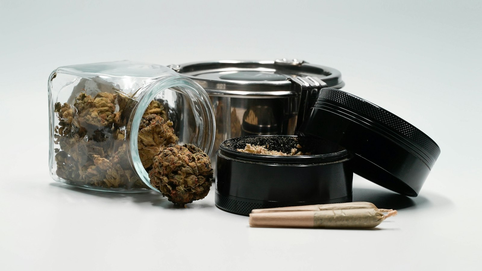
Cover photo: 2H Media / Unsplash.
A cannabis package can look like a streetwear drop, an art print, a luxury skincare box, or a record sleeve. Sometimes the design has so much personality that the actual information seems to be waiting quietly in the corner.
There is a reason people talk about the packaging. It is the part you can photograph, recognize, and judge immediately.
But appearance and evidence are different conversations. A clean layout can be satisfying. An unusual color palette can be memorable. Neither one performs a laboratory test.
Here is why cannabis packaging got so elaborate, what makes it interesting as design, and what the package still needs to communicate beyond the vibe. Understanding cannabis packaging requirements also explains why a good-looking design needs room for closures, readable labels and attached information.
A package tells a story before you read a word
Design starts suggesting a mood quickly. Spare typography can feel restrained. Metallic finishes can suggest luxury. A retro illustration can point toward an earlier era. That is our visual interpretation, not a universal rule, but it helps explain why two containers can seem completely different before their text is read.
The package is doing several jobs at once: identifying the brand, distinguishing one version from another, carrying information, and protecting what is inside.
When those jobs cooperate, the design feels easy to understand. When they compete, the viewer gets a visual shouting match.
This happens far beyond cannabis. Music merchandise and sneaker boxes also use consistent colors, typography, and small repeated details to build recognition. You can spot the same tricks once you start looking for them.
For an editorial photo, an empty package can be a worthwhile artifact. The image tells a design story, even when nobody is making claims about the contents.
There are actual designers behind some of the drama
Pentagram’s documented work for Leafs by Snoop is a useful example. The studio developed a coordinated identity, packaging, and website, built around a faceted cannabis-leaf symbol. Its case study also discusses the broader visual system rather than presenting the box as an isolated decoration.
This matters because branding is often more systematic than it looks. A designer may use the same shape across different formats, assign consistent colors, and organize text so the pieces feel related.
Our take: recognizable packaging works like a visual chorus. You may see a different item, but the repeated design elements make the connection obvious. The shape, type, or color gives you something familiar before you read the name.
Good packaging criticism asks what the system is trying to do. Does it make information easier to find? Does the layout remain readable? Does the identity rely on one loud illustration, or does it still make sense without it?
Those questions give us more to discuss than expensive-looking versus cheap-looking.
The little details are doing the most
Pentagram’s case study gets more interesting when you look past the leaf logo. The flower boxes have clean white exteriors and colorful California imagery inside. Angled slices in the pictures echo the logo’s facets. A tactile, clear-varnish paisley pattern adds another detail to the outside. Colored stickers distinguish versions within the range.
That is a lot happening on one object, but the details have a relationship. Our take: it is closer to a record sleeve with a visual theme than a bag with a random picture slapped on the front. Open it, turn it, and the same ideas keep showing up.
Try the same exercise with any empty package you already have permission to photograph. Name three choices: one shape, one type style, and one color decision. A surprising amount of the mood comes from those basics.
If every detail is trying to be the main character, your eye has nowhere to land. If one thing leads and the others support it, the design feels more deliberate. That is a design judgment, so there is room to disagree. Someone else’s favorite restraint might be your idea of boring.
Three imaginary redesigns, three different moods
Picture the same plain, empty container wearing three entirely fictional identities. Nothing about the contents changes in this exercise. Only the artwork changes.
- The record-store version: a large title, a restrained color palette, and a small catalog-style number. It feels like something you might file on a shelf.
- The workshop version: simple blocks, a useful label, and one strong symbol. It puts organization ahead of decoration.
- The gallery version: a striking abstract image and generous space around the text. The picture gets the first word.
Which one would you recognize across the room? Which one would still make sense as a tiny thumbnail? Which one would you keep after it was empty? Those questions explain why packaging becomes part of the conversation instead of disappearing once its practical job is done.
The fun is noticing what changed your opinion. Was it a better font, a clearer layout, or simply a color you already like? A shiny finish can get your attention, but an interesting idea gives you something to discuss afterward.
The useful information still needs a place to live
California’s Department of Cannabis Control requires child-resistant packaging in its regulated market and sets specific labeling requirements. Its manufactured-product guidance also says a QR code or website cannot replace required attached supplemental labeling. These are California examples; other places have their own rules.
California’s packaging guidance also prohibits imitating products typically marketed to children or people under 21. Interesting adult-oriented design can use typography, abstract art, texture, and historical references without disguising an intoxicating product as a children’s snack.
So the interesting design problem is fitting function into the visual world. Where does the required information go? Can somebody find it without hunting? Does the closure work without ruining the layout? A cool box still has to be a useful box.
Professional artwork does not authenticate a product or prove laboratory results. Keep that distinction, then get back to the more interesting question for this article: what did the designer do that made you look twice?
Design test: cover the logo. Is the layout still understandable?
Imagine removing the brand name from a photo. Can you still tell where the key information goes? Can you identify the intended visual style? A strong design has something to explain beyond the biggest word on the box.
Quick questions
Does professional packaging prove a cannabis product is authentic?
No. Professional-looking artwork is not product authentication. Claims about identity and testing need relevant documentation rather than an attractive box.
Are QR codes enough to replace required label information?
California’s manufactured-product guidance says QR codes and websites are not acceptable substitutes for required attached supplemental labeling. The rules discussed here are California examples, not a universal statement about every jurisdiction.
Sources and further reading
- Pentagram: Leafs by Snoop design case study.
- California DCC: child-resistant packaging.
- California DCC: final-form packaging requirements.
- California DCC: manufactured-product labeling.
- California DCC: testing laboratories and COAs.
More questions about cannabis packaging design
Is resealable weed packaging automatically child-resistant?
No. Closing again and resisting a young child are separate properties. California’s packaging checklist lists resealability separately from child resistance; an ordinary resealable closure is not enough to establish certification.
Why are some edible packages opaque but drink bottles clear?
California’s final-form packaging guidance requires opaque edible packaging and gives cannabis beverages an exception allowing clear or colored glass. That is a jurisdiction-specific rule, not a worldwide design requirement.
What is the difference between tamper-evident and child-resistant packaging?
Tamper evidence helps show whether a seal was opened. Child resistance concerns difficulty of opening by young children. The California checklist treats them as different requirements, so one feature does not prove the other.
Does a small cannabis package still need readable text?
Yes in California’s regulated manufactured-product market. DCC’s labeling guidance requires clear, legible required information and type no smaller than 6 point. Smaller packaging can use qualifying attached supplemental labels.
What happens to child resistance after a weed package is opened?
It depends on the package. California distinguishes initial from lifetime child resistance: the first can end after opening, while the second is maintained through repeated opening and closing. The two are not interchangeable.
Tags: cannabis packaging requirements explained; child-resistant vs resealable weed packaging

2 thoughts on “Why Cannabis Packaging Got So Extra: Art, Identity, and the Fine Print”