The Cannabis Leaf Is More Complicated Than the Logo


Under the Lens · Episode 6 of 7
The cannabis leaf logo is so familiar that a quick glance can feel like the whole story. Several pointed shapes fan outward, the edges have teeth, and the symbol is instantly recognizable. Look at a real leaf closely, though, and the neat icon starts leaving things out.
A cannabis leaf close up is interesting because the actual anatomy is both organized and variable. The familiar fan belongs to a compound leaf made of leaflets. Its edges and veins have detail. The real plant does not have to match the most symmetrical version printed on a sticker.
Cannabis leaflets vs whole leaves
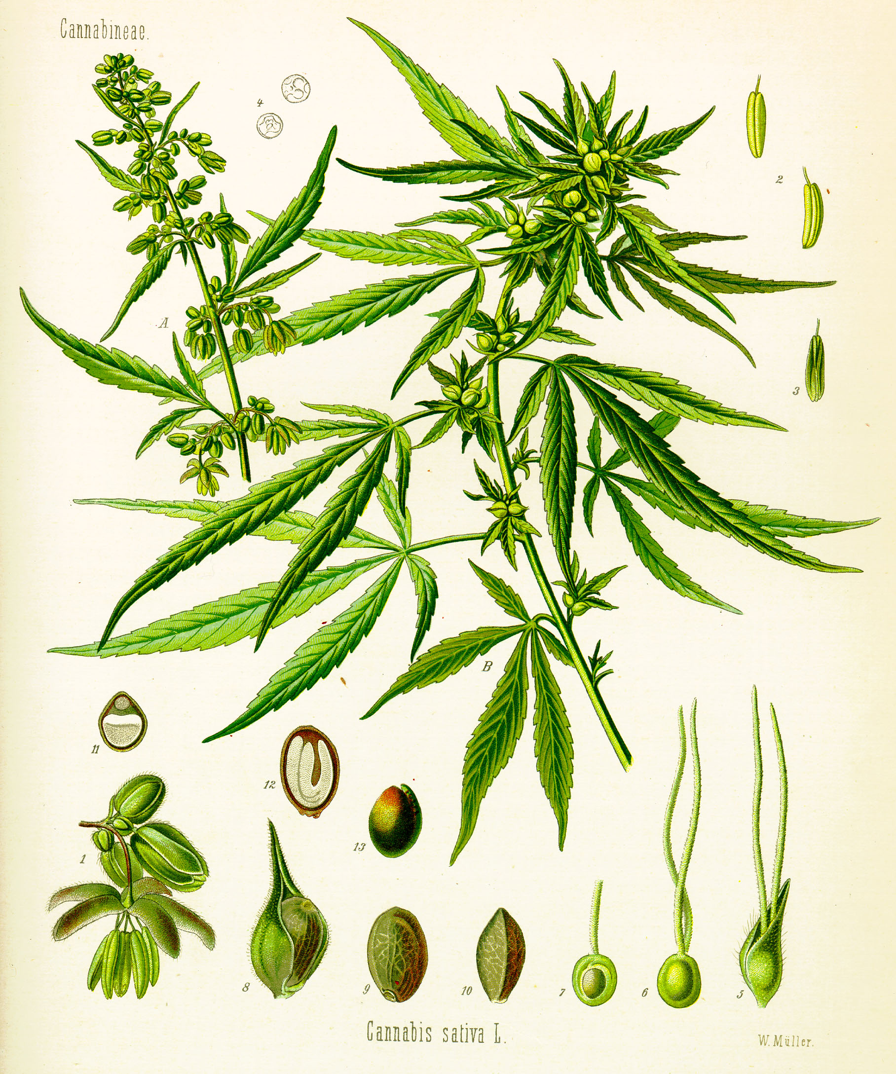
The long pointed parts of the familiar fan are leaflets. They are connected as parts of a compound leaf rather than being a row of independent whole leaves stuck together for the photograph.
The CFIA biology document for Cannabis sativa describes larger leaves with leaflets radiating from the end of a petiole. That handlike arrangement explains the word palmate: the parts spread outward in a form reminiscent of fingers from a palm.
Knowing the distinction changes how you describe a picture. Seven visible pointed parts do not necessarily mean seven whole leaves. The connection matters, so a photograph that includes it can teach more than a crop showing only the tips.
This is one of those small botanical details that sticks once you see it. The silhouette remains familiar, but the units inside it get a different name. A leaf is allowed to contain several leaflets and still be one leaf.
A leaf shape that breaks the familiar pattern
Frisian Duck’s leaf-photo gallery — The duck-foot shapes are a great visual detour after the usual pointed-leaf icon. Scroll between whole plants and individual leaves.
Why cannabis leaves do not always have seven fingers
The same CFIA document describes a variable leaflet number, commonly an odd number from three to thirteen on larger leaves. That is already more range than the tidy seven-part logo suggests.
A particular photograph may show an arrangement within that range, while other leaves on plants can look different. The number should be read as an observed feature of the specimen in view, not a secret code that identifies every trait of the plant.
A designer has good reasons to simplify. An icon needs to remain recognizable when it is tiny, one color or printed on a textured surface. A balanced fan can do that work more easily than a detailed record of every possible leaf.
That is a design interpretation rather than a universal history of how cannabis logos began. The interesting contrast is visible now: the symbol selects a recognizable shape, and the biology permits more variation than that shape keeps.
The little teeth have a botanical name
Serrated describes a sawlike edge. The margin is the edge itself. Put those words together and a serrated margin becomes a precise label for something the eye already recognizes.
In a close-up, the points can make the edge feel much more intricate than it does in a silhouette. Small curves between the teeth create their own repeating rhythm. The tip of a leaflet adds another direction to the overall form.
An outline graphic usually compresses those details. It may keep a few exaggerated teeth so the symbol stays readable. The real edge can be subtler, with scale and angle affecting how strongly the pattern appears in a photograph.
There is no need to assign a purpose to each individual tooth from a single image. Describing the visible margin accurately already gives the viewer something useful to notice.
The veins make a second pattern inside the outline
The outer silhouette is only one geometry. Inside a leaflet, a central vein and its branches give the surface another pattern. The more closely you look, the less the object resembles a flat cutout.
A general botany reference from Oregon State University explains the vascular tissue running through veins and distinguishes branching vein patterns from parallel ones. The lines in the leaf connect to living tissues, even when a logo treats them as optional decoration.
A good photograph can make the branching easier to follow. A crop around one leaflet may reveal a detail that disappears when the entire fan is reduced to a small image. The whole shape and the inner network reward different viewing distances.
It is the same visual pleasure as looking first at the outline of a coastline and then at its inlets. The larger pattern gets you oriented. The smaller patterns keep supplying reasons to look.
Real leaves do not owe the logo perfect symmetry
An icon can give every leaflet a balanced position and make every edge look clean. A photograph records a physical specimen with its actual angles, overlap and visible surface details. Those two images have different jobs.
If one leaflet sits behind another, the outline changes. If the leaf curves relative to the camera, a part can appear narrower. A small imperfection can interrupt the shape without making the picture less botanically interesting.
This is also why a silhouette should not be asked to establish strain identity, chemistry or an effect. It contains only a limited selection of visual information. The recognizable shape is doing cultural work, not delivering a full biological profile.
The symbol is the invitation; the detail is the reward
The logo succeeds when it lets a viewer recognize a subject quickly. The close-up succeeds when it gives that viewer something new to notice after recognition.
Leaflets, margins, veins and connections provide those new details. Each term puts a name to a visible feature without burying the photograph under a wall of technical language.
So keep the familiar leaf symbol, but let the real leaf have more personality than the icon. A close-up can show why the outline became recognizable and why the plant is more interesting than that outline alone. There is a surprising amount of structure hiding inside one small green fan.
Sources and further reading
- Canadian Food Inspection Agency: biology of Cannabis sativa
- Oregon State University Extension: vegetative plant structures
Series cover: original AI-assisted editorial illustration for Trap Snap LA. Photographs carry their own credits.
More questions about cannabis leaf shape and leaflets
What does palmate compound mean for a cannabis leaf?
Palmate describes leaflets spreading from one point in a handlike arrangement. Compound means the whole leaf has multiple leaflets rather than a single undivided blade. CFIA’s botanical description.
Can cannabis leaves have three or thirteen leaflets?
CFIA describes larger leaves with an odd number of leaflets from three to thirteen. A seven-part logo is a familiar simplification, not an exceptionless description of the plant. The official cannabis biology document.
What does serrated mean on a cannabis leaf?
It describes the toothlike margin, or edge. CFIA identifies serrate leaflet margins; the term names a visible botanical feature rather than a chemical or potency property. CFIA’s description of leaflet margins.
What is the stalk of a cannabis leaf called?
The leaf stalk is the petiole. In the described compound arrangement, the leaflets radiate from its far end; each pointed leaflet should not be mistaken for a separate complete leaf. The cannabis leaf-structure description.
Do cannabis leaves grow in the same arrangement all along the stem?
CFIA describes opposite pairs lower on the stem and alternate arrangement nearer the apex. That helps explain why a single tidy logo cannot represent every view of a real plant. The official botanical reference.
Tags: cannabis leaf fingers and leaflet anatomy; palmate compound cannabis leaf meaning